Web Development
How to Plan a Conversion-Focused Website
How to structure a business website around visitor intent, service clarity, trust, forms, CTAs, and follow-up.
By Tayyiba Suleman - Published July 16, 2026 - Updated July 17, 2026 - 7 min read
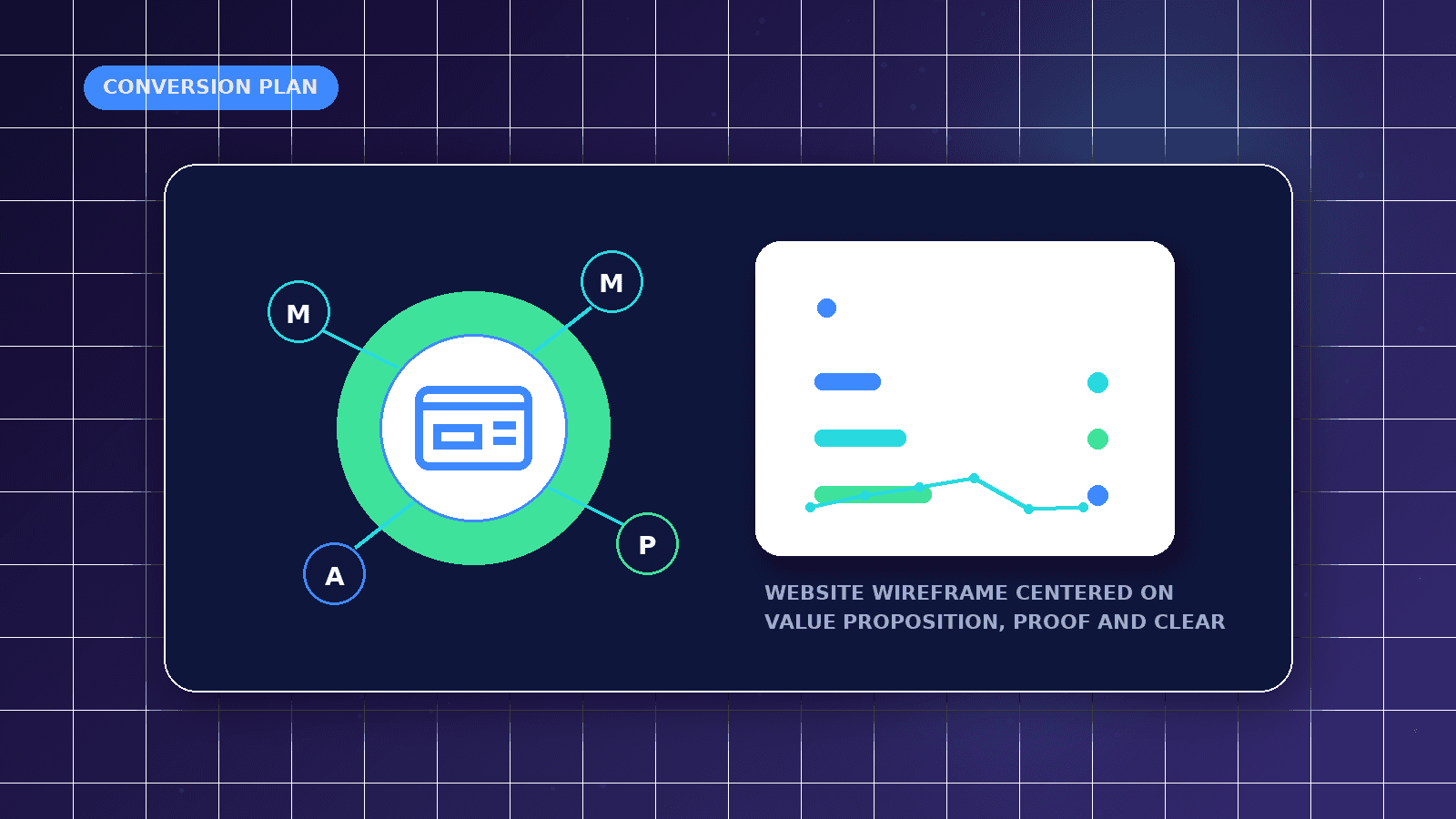
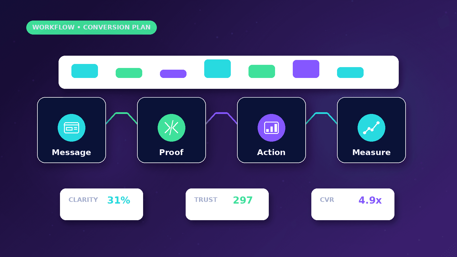
A conversion-focused website makes the next step clear without manipulating visitors. It aligns audience intent, value proposition, trust, navigation, CTAs, forms, speed, analytics, and follow-up. Use this article when a website needs to turn visitor attention into qualified inquiries through better positioning, trust, CTA hierarchy, forms, mobile usability and follow-up.
Reader outcome: Plan for conversions without dark patterns. This article is educational, uses safe CurrentReach AI-owned visuals, and labels illustrative examples where they appear.
How this guide was prepared
This article is written for CurrentReach AI readers using service-planning experience, website implementation patterns, SEO checks, automation workflow review, and practical measurement considerations. It is not copied from a third-party report or generated from private account data.
Reviews structure, mobile usability, performance and conversion paths.
Connects website decisions with SEO, trust and lead follow-up.
Avoids cosmetic-only redesign advice that does not improve user experience.
Audience intent and value proposition
Start by identifying why visitors arrive. Search visitors may be comparing services. Social visitors may be checking credibility. Paid ad visitors may expect one specific offer.
The value proposition should answer who you help, what problem you solve, what service is available, and what action comes next.
Avoid vague claims. Specific services, process, location, contact options, and expected next steps are more useful than broad hype.
CTA hierarchy
A primary CTA should match the main conversion goal, such as booking a strategy call or requesting a quote. Secondary CTAs can support WhatsApp, service exploration, or resources.
Do not place too many equal CTAs in the hero. Visitors should not need to decode the page before taking action.
Repeat CTAs at natural decision points: hero, service sections, FAQs, pricing, and final CTA.
Trust and navigation
Trust can come from founder information, service process, portfolio examples, policies, clear contact details, FAQs, and transparent disclaimers.
Navigation should help users reach core services, about, results, contact, resources, and legal pages without clutter.
If results are illustrative, label them. Verified project examples should be identified separately.
Forms and mobile UX
Forms should use visible labels, clear error states, mobile-friendly fields, privacy acknowledgement, and duplicate-submit prevention.
Mobile visitors need comfortable spacing, readable text, sticky-free content, and touch targets that are easy to use.
WhatsApp can be valuable, but the button should not cover content or interrupt form completion.
Speed, tracking and testing
Conversion work depends on performance. Large images, layout shifts, slow scripts, and heavy animation can hurt mobile trust.
Track meaningful events such as form submissions, booking clicks, WhatsApp clicks, service-page visits, and scroll depth where appropriate.
Testing should start with clear hypotheses: headline clarity, form length, CTA wording, offer framing, proof placement, or page speed.
Common conversion mistakes
Using a beautiful page with unclear service positioning.
Asking for too much information before trust is built.
Sending paid traffic to a generic homepage.
Publishing claims without proof.
Ignoring follow-up speed after the form is submitted.
Message hierarchy and CTA hierarchy
A conversion-focused page should make the value proposition obvious before asking for action. The first screen should explain who the offer is for, what problem it solves, why the visitor should trust it and what action comes next.
Primary and secondary CTAs should not compete. A service business may use Request a Free Strategy Call as the main action, while secondary links can support visitors who need services, proof or FAQs first.
Navigation should reduce uncertainty rather than create escape routes. On a full website, navigation helps people compare services. On a paid landing page, fewer links may be better if the campaign has one tightly matched offer.
Forms, speed and testing
Form length should match visitor intent. A short first-step inquiry form can ask for name, contact method, service interest and a brief message, while deeper qualification can happen after the first response.
Website speed supports conversion because visitors are less likely to wait through slow hero images, heavy scripts or unstable layouts. Mobile speed matters most when traffic comes from social or ads.
Testing does not have to be complicated. Compare CTA clicks, form starts, completed forms, source pages and qualified lead notes before changing copy, layout or form fields.
Worked business example
Example 1: a service-business homepage can use one primary strategy-call CTA, with secondary links to services and proof for visitors who need more context before contacting the business.
Example 2: a paid-ad landing page should usually focus on one conversion action, one audience and one offer. Extra navigation can be reduced when it distracts from the campaign promise.
Example 3: a high-friction inquiry form that asks for budget, timeline, company details, long descriptions and multiple preferences can be split into a short first-step form followed by qualification after contact.
Common mistakes to avoid
Adding more buttons does not automatically improve conversion. Visitors need one clear primary action and supporting paths that match their stage of interest.
Hiding proof, process, policies or contact details forces visitors to trust unsupported claims.
Long forms can reduce completion, but forms that ask too little may create poor lead quality and wasted follow-up.
Decision framework
Define the primary conversion first: strategy-call request, WhatsApp message, quote form, audit request, newsletter signup or account request.
Match CTAs to intent. High-intent visitors may request a call, while early-stage visitors may prefer a guide, service page or resource.
Decide which trust signals are verified and safe to show: process, portfolio classification, screenshots, founder information, policies and clear contact details.
Measurement plan
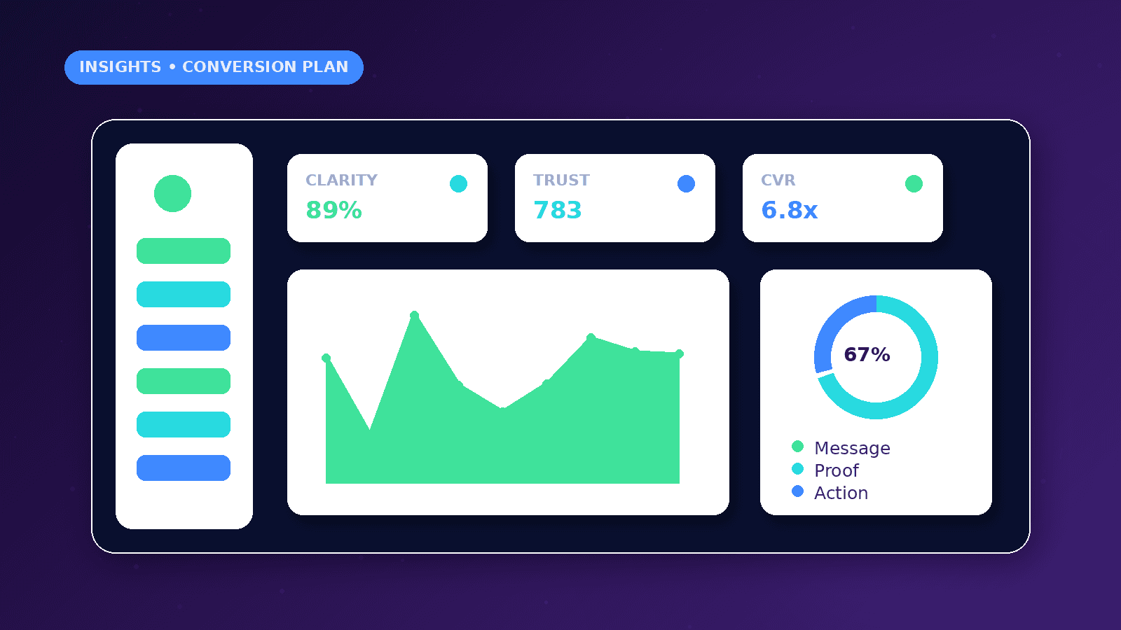
Track primary CTA clicks, form starts, form submissions, WhatsApp clicks, landing-page visits, source page and confirmation-page completion.
Use event tracking to separate curiosity clicks from qualified inquiries. A form that gets fewer but better leads may be more useful than a form that attracts unqualified volume.
Review conversion pages after campaigns, not only before launch. Real objections from sales calls often reveal missing trust signals or unclear service descriptions.
Risks and limitations
Dark-pattern design can create short-term clicks but damage trust and lead quality.
Slow mobile pages reduce the chance that visitors complete forms or read service details.
Tracking gaps can make the business optimize for the wrong action, such as clicks instead of qualified leads.
Practical next steps
Map the visitor journey from first impression to follow-up.
Test forms, mobile layout, focus states, performance and analytics events.
Review lead quality and objections, then improve copy and page structure around real conversations.
Conclusion
A conversion-focused website is not a page covered in buttons. It is a clear path from visitor intent to value, trust, action, confirmation and follow-up.
The strongest improvements usually come from clearer messaging, fewer competing CTAs, mobile-first structure, faster pages and better measurement.
Conversion planning comparison
| Element | Weak approach | Stronger approach |
|---|---|---|
| Headline | Generic company statement | Clear customer outcome |
| CTA | Multiple competing buttons | One primary action |
| Form | Long qualification form | Short first-step inquiry |
| Trust | Unsupported claims | Verified evidence and clear process |
| Mobile | Desktop layout compressed | Mobile-specific hierarchy |
Practical checklist
- Audience intent
- Value proposition
- Primary CTA
- Trust signals
- Mobile layout
- Accessible form
- Fast loading
- Analytics events
- Follow-up workflow
References and further reading
Image sources
- conversion-focused-website-plan/featured-image.png: Original CurrentReach AI blog image pack. License: Owned generated visual. No private data present.
FAQs
Should every page have the same CTA?
No. Keep one primary site-wide action where appropriate, but adjust secondary CTAs to match page intent.
How many fields should an inquiry form contain?
Ask only for fields needed to take the next step. Longer qualification can happen after the first inquiry when friction matters.
Does website speed affect conversion?
Yes. Slow pages can reduce attention and form completion, especially on mobile and paid traffic.
When is a landing page better than a full website?
A landing page is better when a campaign has one audience, one offer and one measurable action.
How should conversion goals be measured?
Measure meaningful actions such as form starts, submissions, call clicks, WhatsApp clicks, booking requests and qualified lead outcomes.
Need help applying this?
Need a clearer, faster and more conversion-focused business website? Explore CurrentReach AI’s Web Development Services.
Related guides
About the author
Tayyiba Suleman is Web Developer and Automation Developer. Articles are reviewed against the Editorial Policy and should be read with the Content Disclaimer.